It's funny, I actually wrote up an over9000 word post on calibrating your monitors both by eye and using a colorimeter/spectrometer, but then figured it'd be entirely too wordy and so snubbed it without bothering to save it... But I'm gonna cover at least a few things here for now.
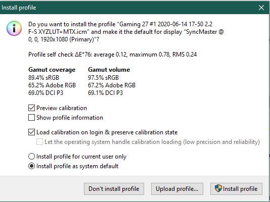
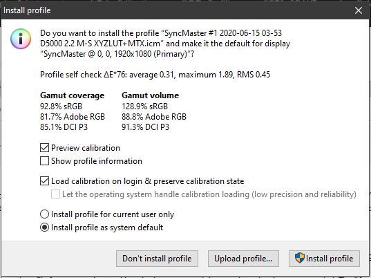
So what you're seeing here is actually a kinda-bad result, suggesting to me that something was possibly wrong with your OS settings, driver-borne image settings, monitor settings or DisplayCal settings.
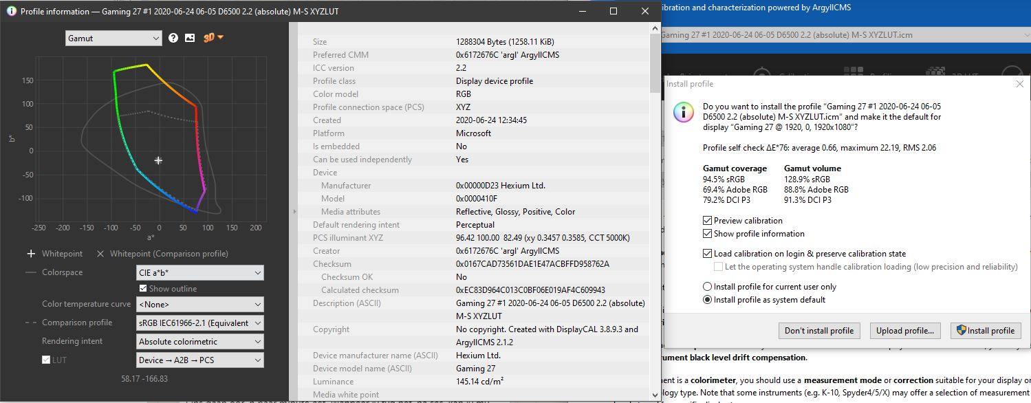
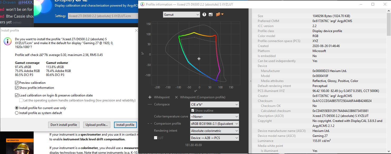
The left group, Gamut Coverage, is what the monitor ended up calibrating to. The right are the theoretical maximum gamut volume (that is, think of a 2L container as the 'volume' and the 'coverage' being how much liquid you were able to fill that container with). However, the /maximum/ deviation being less than DeltaE 1.0 is very good; that means while the monitor's
coverage and volume are both not 'full' for the sRGB spectrum (the primary spectrum almost all PC content you will consume is 'mastered' for and software typically attemps to display within), at least the representations of the hues and shades will be
accurate. A 'dull' image isn't nearly as bad as an 'off-hue' image; seeing things which are meant to be violet as blue as example, or orange as yellow or worse, brown, can completely ruin one's experience of a variety of media.
Personally, I don't consider any modern monitor to have a half-way decent panel unless it can attain at least 80% Adobe RGB
coverage and in excess of 95% sRGB
coverage. Ideally, the volume of both would be at least 85% and 105%, respectively.
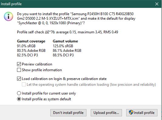
Here is my Samsung P2450H, which has a thoroughly-aged backlight and was manufactured in 2009, as example:
Notice it has a large maximum deviation; in this monitor's case, that deviation is primarily in very dark blue areas, which comes down to the panel and backlighting combination in use.
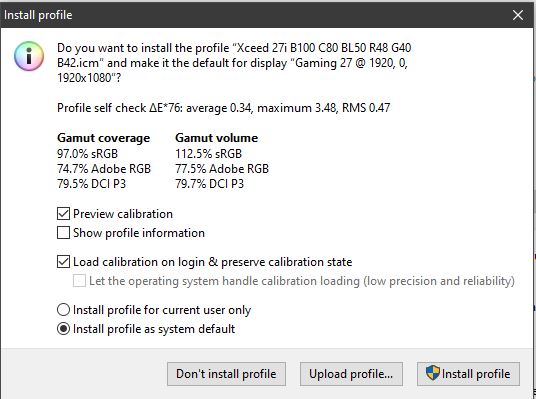
Unfortunately I went and deleted my 25UM58-P's result's screenshot and the ICC profile since I haven't been using the monitor in many months now, so don't have a third example; but the last calibration I did on that had around 99%/83%/87% sRGB, AdobeRGB and DCI P3 coverage.
DCI P3, by the way, is a gamut originally developed for 'digital video', and is the gamut some modern non-HDR panels are being made to conform to. It covers the entirety of sRGB, it simply stretches for more coverage in a different 'direction' than Adobe RGB does:
How do P3 displays affect your workflow? - CreativePro.com - it's not a gamut I would necessarily recommend specifically trying to calibration for, however.
Anyway, on to what you should be doing when calibrating your monitors with DisplayCal.
First and foremost, the most important things you're going to want to do are ensure there is NOTHING dynamically nor statically adjusting ANY aspect of the displayed picture on any level. This means you want to ensure you:
* Disable/revert any and all colour/brightness/contrast-related settings you've made in your graphics display driver and/or GeForce Experience or Adrenalin software
* Ensure your driver is outputting FULL colour range (0-255) (this is available as an option only when connecting via HDMI or DisplayPort, typically) - if the choice between 'TV' and 'PC' is also/alternatively available, select 'PC'
* Disable ANY form of black level compensation in drivers (if present) AND on the monitor. The HDR functionality of the monitor may very well make use of software processing rather than being 'true' HDR, so disable the HDR mode for calibration
* Brightness and Contrast should be at the monitor's defaults, as should the RGB values
*
Ensure Night Light in Windows is disabled and/or will not be turning on or off mid-calibration
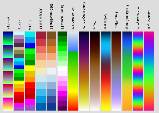
* If there are 'gamma' options on the monitor and one of them is 'off', put it on that. If they are simply titled 'mode', then after ensuring nothing is adjusting the image, open this chart and fill the screen with it, then compare the different 'modes' and find one which has the most consistent change going from darkest to brightest; you don't want the left nor right side to seem like it has a 'quicker' change between bright or dark than the opposite end:
Next, you want to ensure the function of your brightness and contrast sliders. Fill your screen with a black image and turn off all lights in your room you can; you essentially want to be able to see nothing but your monitor's backlight bleed; your eyes may/may not take a while to adjust to the darkness for you to notice it.
Now adjust the brightness slider down from what's presumably a default of 100 and try to ascertain whether the backlight is dimming or not. If it doesn't seem to be getting dimmer, change the brightness back to default and adjust the contrast slider instead. Note on which of the two it gets darker (it should be on Brightness) and reset to default.
In DisplayCal, on the 'display & instrument' page you want to select 'auto' under correction, optionally enable the white/black level drift compensation options (shouldn't be necessary, will increase calibration time but if you can stand leaving the monitor alone for a few hours it may be worth using them). On the calibration page you want to choose 'interactive display adjustment', whitepoint as 'colour temperature' of 6500K (if you can't achieve 6500K with an acceptable brightness and leveled RGB values, incrementally tune it back 500K at a time - the lower the number, the more 'yellow', or 'warmer', your calibration will end up having to be), white level to 'as measured', tone curve of 'gamma 2.2' and calibration speed of medium.
For general use in a well-lit room you want a brightness of at least 120cdm2. Calibrating to a specific brightness isn't really necessary unless you're trying to match apparent image brightness between different environments; remember that your resulting ICC profile is going to be for a
specific brightness level at the time of calibration. As such, if someone else tries to use the same profile at a different brightness, they will inherently have a different experience of it than you did; this applies doubly-so if their viewing environment's colour temperature/brightness is different to yours.
But I digress. Put some imagery on your screen which represents what you'll most-typically look at and adjust whichever 'brightness' slider changed your backlight level until the image has a comfortable brightness for you. Now start the calibration in DisplayCal.
It will tell you what your starting brightness is and this will be the 'measured' point to which you are going to be trying to adjust your RGB values. As you adjust any one of these values
down there will typically be a corresponding drop in the brightness measured.
Note that on
many monitors, adjusting the numbers up from where they started (if a value like 50 between 0 and 100) will actually
clip and
not increase the actual brightness of that value. If you want to check this, load up this image:
While adjusting one of the RGB sliders, look at the stepped gradients of the corresponding colour. If while adjusting it up several different steps seem to become closer to the same colour, that means that value is clipping and the difference between the colours is, obviously, reducing; this is bad, as it means you're reducing the available
volume of gamut. On some monitors, adjusting these sliders to their minimums will completely remove that colour. This would indicate a similarly-bad problem, because what's happening here is colour information is being removed from the image to be displayed; this
also means you're reducing coverage.
If this happens it means you may not actually be able to use those sliders for adjusting the RGB values of the monitor for calibration purposes; they may linearly do this throughout the entire available range or there may be a specific point at which it begins happening, I don't have the monitor yet so I can't determine this for you.
Anyway, if it doesn't and it simply makes the relevant colour appear 'darker', that's precisely what you want, as the intensity of that portion of the signal is simply being modified. Proceed to adjust your RGB values to get them centered in Displaycal, then tune your brightness back to where you wanted it to be (if the change was significant), and continually shuffle the RGB sliders and brightness till you match everything up.
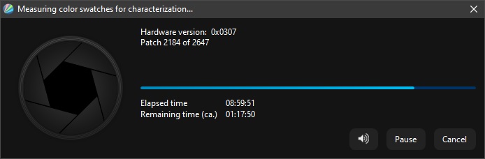
Once they're all spot on, tell it to start calibrating and go do something else for the next few hours.
AFTER the calibration has completed, THIS is when you can start messing with vibrance adjustments in programs and games.
The entire point of the calibration of the monitor is to ensure that, if the computer had told the monitor to display a RGB value of 128,128,128, it would display as that, not as 140,128,109. In this way, if you look at a product photo like that of a car online and you don't have your driver doing funky things to your colours like boosting vibrance or w/e (and honestly, if sRGB volume and coverage on the thing were close to or exceed 100%, you shouldn't realistically WANT to increase vibrance for 'general use'), what you see in the product photo is supposed to be what you'd get colour-wise, since car manufacturers are particular about their cars looking in photos as they do in person.
If I've missed something or something isn't clear, let me know and I'll try to add/clarify as necessary.
Edit: an important note about calibration; if it was done correctly, then putting one monitor next to another may make either monitor look like it's significantly more blue/yellow or even
green or
magenta than the monitor it's being compared to. This has to do with how your brain adjusts to the colours you see. This is an important article to read on the matter; ultimately if you've got a colour-calibrated monitor then you shouldn't feel "oh no, this one looks terrible compared to the rest", but instead "the rest are not displaying things correctly".
Because if you were to view the lot in 'direct sunlight' (assuming their images were all bright enough to compete with unshaded daylight), only the calibrated monitor's whites would actually be and appear white while the other monitors' would appear tinted. So, rather try to get all your other displays colour-matched to your calibrated monitor, or accept that you're going to have inaccurate colours on all of them if you try to colour-match the monitor you would have otherwise calibrated objectively with hardware, 'subjectively, by eye' instead.
TL;DR this version is shorter than what I threw away and more to the point, even - sorry.
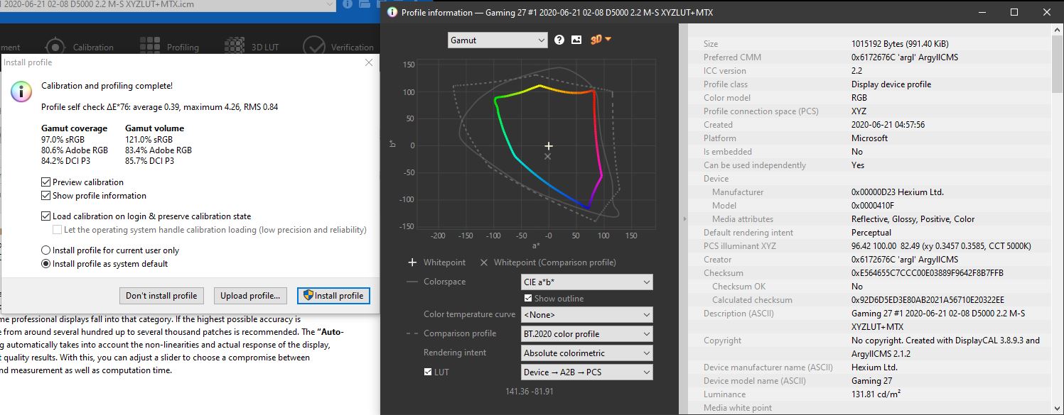
Edit edit, this is the result of a 425-patch calibration with white/black drift compensation enabled, and allowing for an extra 3h on top of what's usually a 1h40min calibration:
Edit edit edit: also note the 'D5000' in the filename, which implies I calibrated at 5000K instead of 6500K. My monitor can't produce enough 'blue' from its backlight to calibrate to 6500K anymore. Considering how dim the calibration ends up (around 75cdm2) I have to use it in a darkened room in which the lighting is 6000-6500K anyway, so it 'looks' correct, at least. I wouldn't be able to continue using this monitor for working on photos anymore, though, as what I see on the screen would look very different to the same image printed out and held next to it, colour temperature wise.
I don't know whether this is affecting anyone else, but recently my DisplayCal profile loader doesn't seem to be able to make the profile 'stick'. Remedied easily by doing:
1. open start menu
2. 'advanced color' (click monitor with colourful thing in it and page with colorful thing on it)
3. enable 'use my settings'
4. 'add'
5. from the list, select the profile DisplayCal had created
6. click 'ok'
7. click 'close'